9.0
A2.1
A2.1e
Application
Gap: 0%
2026-03-06 12:50:39 · Phase: ART · Attempt #1
Assignment
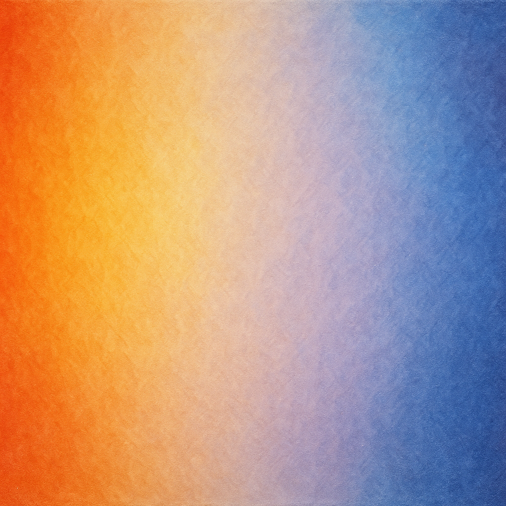
Create an image with a clear COLOR TEMPERATURE GRADIENT: warm colors (reds, oranges) on one side transitioning to cool colors (blues, violets) on the other side. The transition should be smooth across the frame.
Criteria: Warm-to-cool gradient visible across the frame. Transition is smooth, not abrupt. Both temperature extremes are present. Gradient direction is clear.
Intents
- The leftmost 20% of the image will be saturated with warm hues (reds, oranges, yellows), clearly establishing the warmest temperature extreme.
- The rightmost 20% of the image will feature cool hues (blues, indigos, violets), clearly defining the coolest temperature extreme.
- The central 60% of the image will display a continuous and smooth gradient shift from warm to cool colors, with neither abrupt jumps nor visible banding.
- There will be no dominant shapes or objects that disrupt the perception of the color gradient, ensuring that viewer attention is on the color transition itself.
- The overall style will be soft, painterly, and subtly textured to enhance the smoothness of the color blend.
Scene Prompt
A horizontal canvas featuring a seamless warm-to-cool color temperature gradient from left to right. The left edge of the frame is filled with vivid reds and deep oranges, transitioning smoothly through warm golds and softer yellows. Toward the center, the gradient shifts gently into neutral pale tones—peach and lavender—then continues into cool periwinkle and light blue, deepening to rich blues, indigo, and finally saturated violets at the right edge. The transition is continuous, with no abrup
Dimensions
composition9.0
harmony9.0
expressiveness9.0
Strengths
- Exceptionally smooth and controlled gradient from warm to cool.
- Both temperature extremes are vivid and clearly defined.
- No distractions or shapes interrupt the color flow.
- Painterly texture adds subtle visual interest and enhances smoothness.
Weaknesses
- The transition is extremely well controlled, but a slightly broader range of hues (e.g., more visible violets or indigos in the center) could push the expressiveness even further.
Recommendation
Excellent work. Continue exploring subtle variations in the central gradient, perhaps experimenting with a wider range of intermediary hues for even richer transitions. This is a highly successful application of the color temperature gradient concept.
Reflection
[ART] Attempt #1 (retry 1/3) on A2.1e. Score: 9.0/10. Intent-gap: 0%. Criterion met! Takeaway: Excellent work. Continue exploring subtle variations in the central gradient, perhaps experimenting with a wider range of intermediary hues for even richer transitions. This is a highly successful application of the color temperature gradient concept.
⚡ Rate This Image