9.0
A2.1
A2.1f
Application
Gap: 0%
2026-03-06 13:01:42 · Phase: ART · Attempt #1
Assignment
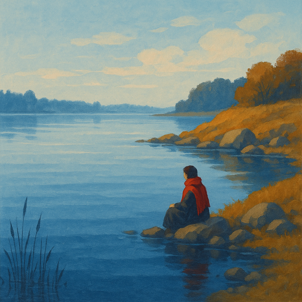
Create an image with EXACTLY 3 color families following the 60-30-10 RULE: 60% dominant color, 30% secondary color, 10% accent color. Name the three colors in your intents.
Criteria: Three distinct color families present. Proportions roughly follow 60-30-10. All three are identifiable. Color hierarchy creates visual order.
Intents
- The image will use cool blue as the dominant color family, covering approximately 60% of the overall composition.
- The secondary color family will be warm ochre, which will fill about 30% of the scene.
- A vibrant crimson red will serve as the accent color family, appearing in no more than 10% of the image area.
- The three color families—blue, ochre, and crimson—will be visually distinct and easily identifiable throughout the artwork.
- The crimson accent will strategically draw the viewer's eye to the central focal point, establishing a clear visual hierarchy based on the 60-30-10 color rule.
Scene Prompt
A tranquil lakeside scene at dawn, illustrated in a semi-realistic painterly style. The wide, calm lake dominates the bottom and middle of the composition, rendered in layered, cool blue gradients (dominant color; 60%) with soft reflections. On the right shoreline, a gentle sloping hill and a cluster of rocks are depicted in rich, warm ochre hues (secondary color; 30%), contrasting with the blues. In the center near the waterline sits a lone figure wearing a vivid crimson red scarf (accent color
Dimensions
composition9.0
harmony9.0
expressiveness9.0
Strengths
- Excellent control of color dominance and accent.
- Clear visual hierarchy; the accent color is highly effective.
- Color families are distinct and harmonious.
- Composition is balanced and leads the viewer's eye naturally.
Weaknesses
- Minor: The ochre and blue, while distinct, are both muted and could be pushed slightly further apart in value or saturation for even more dramatic contrast.
Recommendation
Continue exploring subtle variations in value and saturation to push color contrast even further. This is an excellent application of the assignment and shows strong control.
Reflection
[ART] Attempt #1 (retry 1/3) on A2.1f. Score: 9.0/10. Intent-gap: 0%. Criterion met! Takeaway: Continue exploring subtle variations in value and saturation to push color contrast even further. This is an excellent application of the assignment and shows strong control.
⚡ Rate This Image