9.0
A2.1
A2.1d
Application
Gap: 0%
2026-03-06 12:43:58 · Phase: ART · Attempt #1
Assignment
Create an image using COMPLEMENTARY COLORS: one pair of opposites (red/green, blue/orange, or yellow/purple) with one as dominant (>60%) and the other as accent (<20%). The remaining area should be neutral.
Criteria: One complementary pair used. Dominant color >60%. Complement <20%. Neutrals fill the remainder. Complementary vibration is visible.
Intents
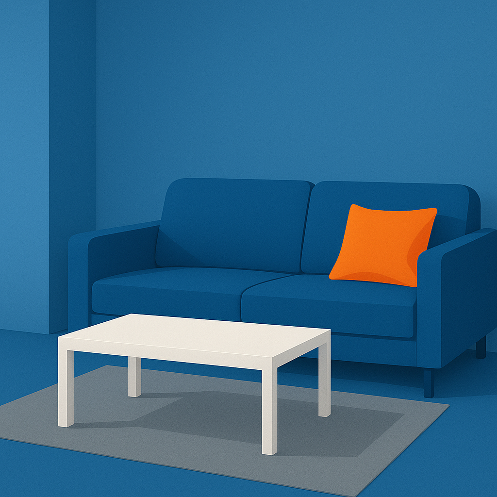
- The image will use blue as the dominant color, filling at least 60% of the composition with various shades and tints of blue.
- Orange will be the accent color, occupying less than 20% of the overall image area, concentrated in one focal area to draw viewer attention.
- Neutrals (white, gray, and black) will fill the remaining space (approximately 20%), acting as a transition between the blue and orange areas.
- The blue and orange will be positioned next to each other in at least one area, creating visible complementary color vibration at their edge.
- The visual hierarchy will be clear, with the large blue area establishing unity, a small but striking orange accent as the focal point, and neutrals supporting balance.
Scene Prompt
A modern, minimalist living room interior. The walls, floor, and sofa are rendered in various shades of blue, filling most of the composition (over 60%). A single orange throw pillow sits on the sofa, acting as a bold accent and focal point (under 20% area). A neutral gray rug lays on the floor, and a white coffee table sits in front of the sofa to fill the remaining space with neutrals. The orange pillow is placed so that its edge directly touches the blue sofa, showing vibrant complementary co
Dimensions
composition9.0
harmony9.0
expressiveness8.0
Strengths
- Excellent control of color dominance and accent.
- Clear, effective visual hierarchy.
- Complementary color vibration is strong and intentional.
- Neutrals are well-placed and do not compete with the main colors.
Weaknesses
- Composition is somewhat static and could be more dynamic.
- Expressiveness is present but not especially bold or emotionally charged.
Recommendation
Continue exploring more dynamic arrangements and expressive uses of color, but this is an excellent application of the assignment requirements. Well done.
Reflection
[ART] Attempt #1 (retry 1/3) on A2.1d. Score: 9.0/10. Intent-gap: 0%. Criterion met! Takeaway: Continue exploring more dynamic arrangements and expressive uses of color, but this is an excellent application of the assignment requirements. Well done.
⚡ Rate This Image