9.0
A2.2
A2.2i
Synthesis
Gap: 0%
2026-03-08 06:06:40 · Phase: ART · Attempt #1
Assignment
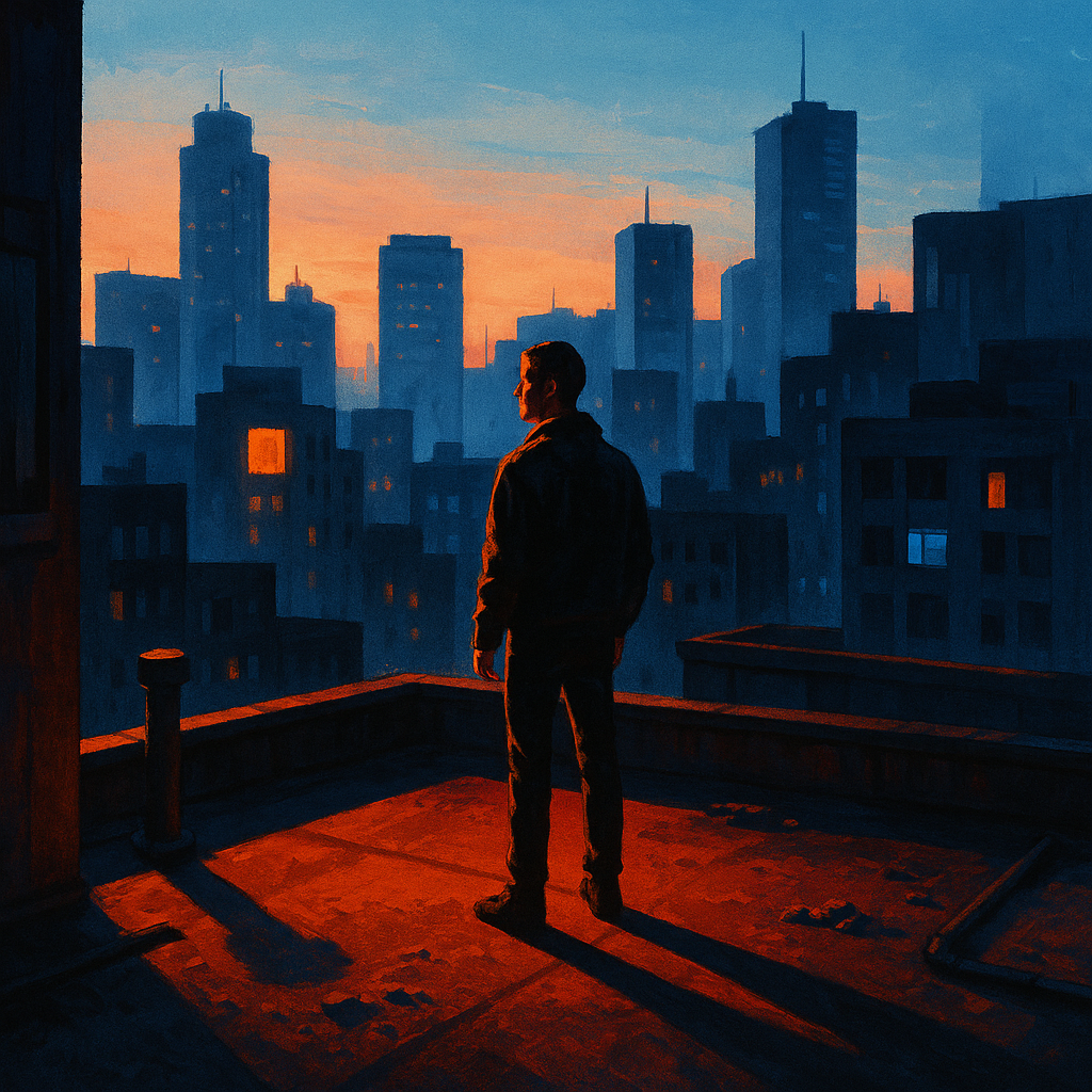
Create an image with FULL PALETTE CONTROL: a specific color harmony (complementary, analogous, or triadic — state which), the 60-30-10 ratio, a warm/cool gradient from foreground to background, and at least 5 distinct value steps from dark to light.
Criteria: Named color harmony type. 60-30-10 ratio. Warm/cool depth gradient. 5+ distinct value steps. All palette rules work together. High technical execution.
Intents
- I will use a complementary color harmony of blue and orange, clearly distinguishing these two hues throughout the image.
- The palette will follow a 60-30-10 ratio: 60% cool blue tones, 30% warm orange tones, and 10% neutral greys.
- There will be a clear warm-to-cool gradient, with warm orange tones concentrated in the foreground and cool blue tones dominating the background.
- I will include at least 5 distinct value steps, ranging from very dark shadows in the foreground, midtones in the midground, to bright highlights in the background.
- The color and value palette will work together to create an atmosphere that feels energetic but dramatic, using high contrast and saturated complements.
Scene Prompt
A lone figure stands on a city rooftop at sunset, gazing out over the skyline. The foreground (roof surface and the figure) glows with deep, saturated oranges and rusty reds, illuminated by the low sun. Midground buildings are painted in muted blue-greys, transitioning towards intense cobalt and deep navy in the far background. The sky shifts from a warm peach near the horizon to icy blue overhead. Neon lights and reflected windows add pops of pure orange and blue throughout. The composition is
Dimensions
composition9.0
harmony10.0
expressiveness9.0
Strengths
- Palette control is masterful; color harmony is clear and intentional.
- Value structure is strong, guiding the eye and creating depth.
- Expressive use of color and light to set mood.
- Composition is well-balanced, with a clear focal point and atmospheric depth.
Weaknesses
- A very minor note: the 10% neutral grey is subtle and could be slightly more pronounced for absolute clarity, but this does not detract from the overall effect.
Recommendation
Continue to push subtlety in neutral tones and experiment with even more complex palette relationships. This work is a strong example of full palette control and would impress at an advanced level.
Reflection
[ART] Attempt #1 (retry 1/3) on A2.2i. Score: 9.0/10. Intent-gap: 0%. Criterion met! Takeaway: Continue to push subtlety in neutral tones and experiment with even more complex palette relationships. This work is a strong example of full palette control and would impress at an advanced level.
⚡ Rate This Image