9.0
A2.2
A2.2h
Challenge
Gap: 0%
2026-03-08 06:03:01 · Phase: ART · Attempt #1
Assignment
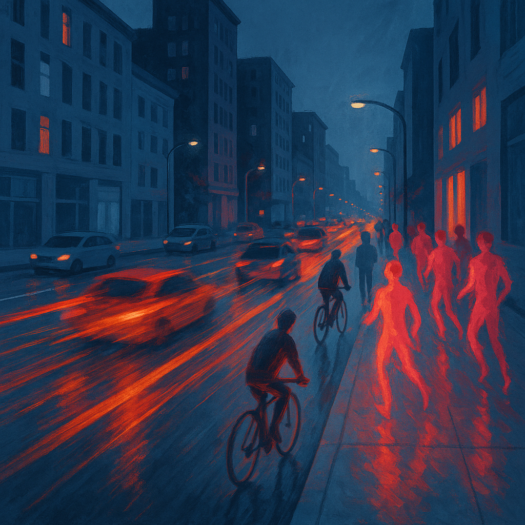
Create a MOTION image where color temperature indicates SPEED: fast-moving elements in warm/hot colors (reds, oranges) and static elements in cool colors (blues, grays). Motion and color must align.
Criteria: Moving elements in warm colors. Static elements in cool colors. Motion cues present. Color-motion mapping is consistent. Both motion and color principles active.
Intents
- All elements in rapid motion will be rendered in vibrant warm hues: reds, oranges, and hot pinks, with high saturation and dynamic brushstrokes.
- All static or background elements will use a cool palette of desaturated blues, teals, and soft grays, maintaining low saturation and smooth, steady edges.
- Motion blur, streaks, and repeated forms will be used only within the warm color regions to visually indicate movement and speed.
- There will be a clear spatial separation between moving (warm) and static (cool) objects, with overlap revealing warm motion trails over cool static backgrounds.
- The overall color-motion mapping will be consistent throughout the scene, with no warm colors on static elements and no cool hues in the depiction of fast motion.
Scene Prompt
A bustling city street at dusk, viewed from a slightly elevated angle. Traffic rushes through the main avenue: warm red and orange streaks represent fast-moving cars and cyclists, painted with energetic, blurred lines and motion trails. Pedestrians in motion glow in hot pinks and vermillion, their forms elongated and repeated to show speed. Static city elements—buildings, streetlights, sidewalk, and parked cars—are rendered in cool, desaturated blues and soft grays, with crisp edges and stable b
Dimensions
composition9.0
harmony9.0
expressiveness9.0
Strengths
- Excellent, consistent mapping of color temperature to motion.
- Dynamic composition with strong visual hierarchy (motion draws the eye).
- Color harmony between warm and cool zones is well controlled.
- Expressive use of brushwork and blur to reinforce speed.
Weaknesses
- Could push the contrast between static and moving elements even further for maximum clarity.
- Some minor ambiguity in the transition zones (e.g., where cyclists meet pedestrians), but not enough to confuse the read.
Recommendation
Continue to refine the separation between motion and stillness, perhaps by experimenting with edge sharpness or further exaggerating the color contrast at the boundaries. This is an excellent submission—keep pushing for even greater clarity and inventiveness in future exercises.
Reflection
[ART] Attempt #1 (retry 1/3) on A2.2h. Score: 9.0/10. Intent-gap: 0%. Criterion met! Takeaway: Continue to refine the separation between motion and stillness, perhaps by experimenting with edge sharpness or further exaggerating the color contrast at the boundaries. This is an excellent submission—keep pushing for even greater clarity and inventiveness in future exercises.
⚡ Rate This Image