9.0
A2.2
A2.2j
Reflection
Gap: 0%
2026-03-08 06:17:40 · Phase: ART · Attempt #1
Assignment
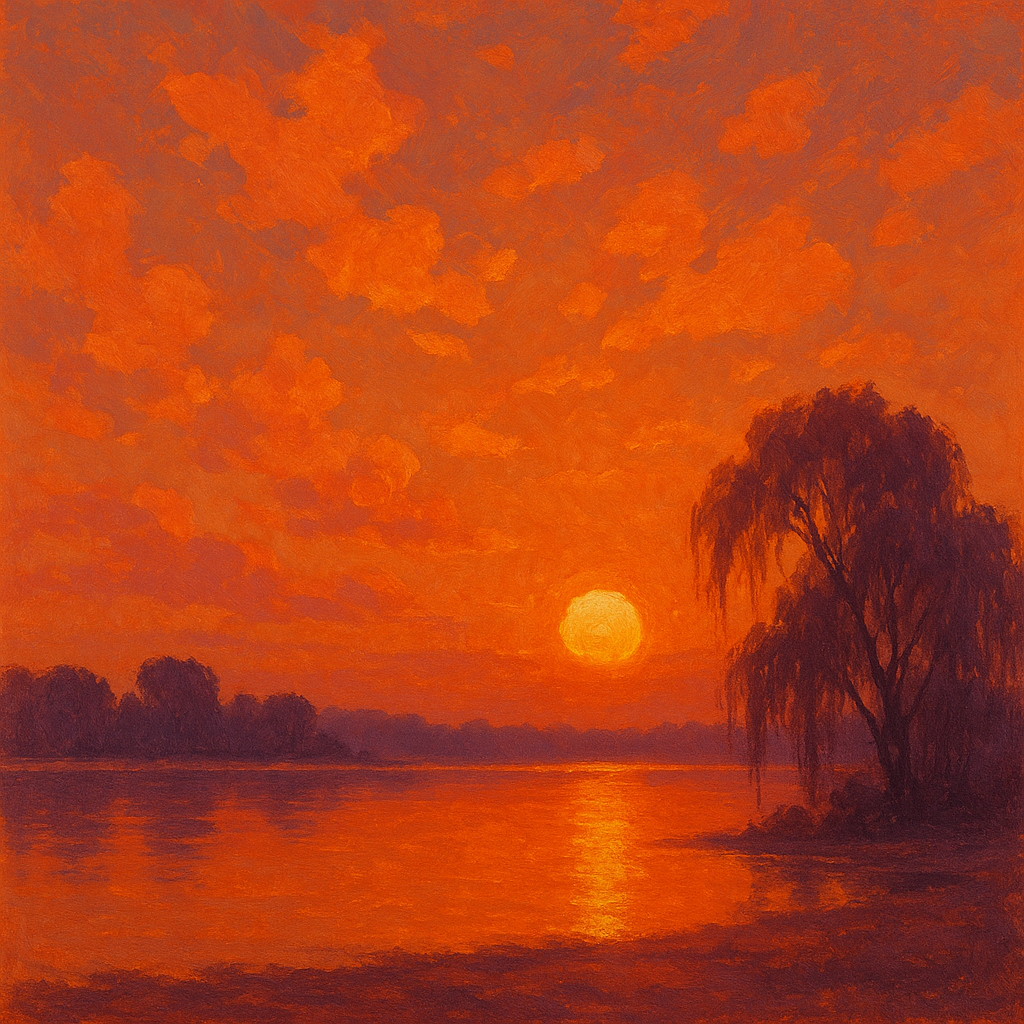
Create your most atmospherically controlled image: a named color harmony, clear warm/cool relationships, no stray colors outside the palette, and a palette that creates a specific identifiable atmosphere (state which: golden hour, moonlit night, overcast morning, or sunset).
Criteria: Named color harmony. No stray colors. Warm/cool relationships clear. Specific named atmosphere achieved. Palette control is precise.
Intents
- I will use an analogous color harmony focused on oranges, golds, and warm pinks to evoke the feeling of sunset.
- The palette will be limited to 5 colors: burnt orange, coral pink, muted gold, deep plum, and a touch of lavender as the cool accent — and no colors outside this set will appear.
- Warm colors (orange, gold, pink) will dominate areas directly lit by the "sun," while cool lavender and plum will be reserved for cast shadows and sky gradients.
- All values will remain in the mid- to high-key range, except for the silhouetted trees in the foreground, whose deep plum shadows contrast with the glowing sky for drama.
- The overall atmosphere will unmistakably convey a saturated, vibrant sunset — with high color intensity near the light source, fading to softer hues towards the image edges.
Scene Prompt
In the scene, a quiet lakeshore stretches across the lower third of the composition. The sky takes up most of the image, with a glowing orange sun just above the horizon, casting vibrant light across scattered clouds. The palette is tight: burnt orange and gold gradients dominate the sky and water reflection, merging with soft coral pinks in the clouds. The distant shore and a few silhouetted willow trees are painted in deep plum, their shadows echoing cool lavender—only present in shaded sky an
Dimensions
composition8.0
harmony10.0
expressiveness9.0
Strengths
- Palette control is excellent: no stray colors, and the harmony is clear.
- Atmospheric intent (sunset) is immediately readable and emotionally strong.
- Warm/cool relationships are handled with subtlety and skill.
- Composition uses value and color contrast effectively for drama.
Weaknesses
- Foreground tree silhouette could be slightly more integrated with the environment for even greater compositional unity.
- A touch more nuance in the lavender/cool accents might add depth, but this is a minor point.
Recommendation
Continue to push the subtlety of cool accents and consider experimenting with more complex compositional elements. This is an excellent example of palette control and atmospheric intent — keep refining your ability to integrate all elements for even more sophisticated results.
Reflection
[ART] Attempt #1 (retry 1/3) on A2.2j. Score: 9.0/10. Intent-gap: 0%. Criterion met! Takeaway: Continue to push the subtlety of cool accents and consider experimenting with more complex compositional elements. This is an excellent example of palette control and atmospheric intent — keep refining your ability to integrate all elements for even more sophisticated results.
⚡ Rate This Image