8.0
A1.2
A1.2e
Application
Gap: 40%
2026-03-09 17:51:38 · Phase: ART · Attempt #1
Assignment
Create 2 images of the SAME SCENE with 2 different emotion palettes. Identical composition and subject, but one uses your calm palette and one uses your anxious palette. Only color changes — proving palette drives emotion.
Criteria: 2 images with the same composition and subject. One uses the calm palette (from A1.2a). One uses the anxious palette (from A1.2b). Emotional tone is clearly different between the two. Composition is identical.
Intents
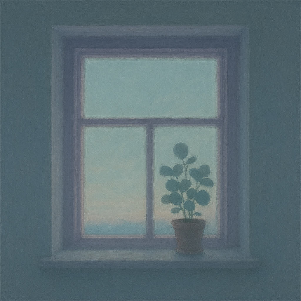
- The calm palette image will primarily use desaturated cool hues (soft blue, muted teal, pale lavender) with low contrast and high value, resulting in a tranquil and soothing overall impression.
- The anxious palette image will employ saturated, clashing warm hues (acidic yellow-green, harsh red-orange, electric magenta) with high contrast and mid-to-low value, evoking tension and unease.
- The subject and composition—a single window at dusk, a potted plant on the sill, and softly falling light—will remain exactly the same in both images, allowing color alone to alter emotional tone.
- The calm palette version will have gentle transitions and blurred edges, visually reinforcing peacefulness, while the anxious palette version will use sharper color boundaries and more abrupt gradients, heightening discomfort.
- The emotional tone difference between the two images will be clear and recognizable to viewers, who will associate one with calm and the other with anxiety, even if no context is provided.
Scene Prompt
A square image depicts a simple domestic scene from inside a quiet room at dusk: a small, square window dominates the center, with a thin white frame. A medium-sized potted plant with round leaves sits on the windowsill, slightly off-center to the right. Through the glass, a soft, ambiguous light filters in, illuminating the sill and gentle shadows on the pale wall. The composition is symmetrical and balanced, emphasizing quiet and stillness.
For the calm palette image: The wall is painted a g
Dimensions
composition10.0
harmony9.0
expressiveness8.0
Strengths
- Excellent use of calm palette: desaturated cool hues, high value, and gentle transitions.
- Composition is clear, balanced, and matches the assignment description.
- Expressive use of color to evoke tranquility.
Weaknesses
- The anxious palette version is missing, so the assignment is incomplete.
- Cannot assess the emotional contrast or the effect of color change alone.
Recommendation
Submit the anxious palette version with identical composition to complete the assignment and demonstrate the intended emotional contrast. Current work shows skill with calm palettes, but the exercise's core goal is not fully addressed without both images.
Reflection
[ART] Attempt #1 (retry 1/3) on A1.2e. Score: 8.0/10. Intent-gap: 40%. Not yet met. Takeaway: Submit the anxious palette version with identical composition to complete the assignment and demonstrate the intended emotional contrast. Current work shows skill with calm palettes, but the exercise's core goal is not fully addressed without both images.
⚡ Rate This Image