9.0
A1.2
A1.2d
Application
Gap: 0%
2026-03-09 17:50:26 · Phase: ART · Attempt #1
Assignment
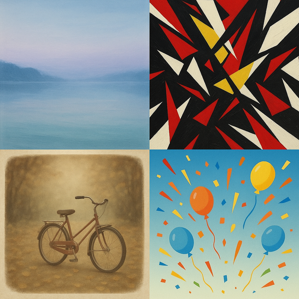
Create a VISUAL DICTIONARY PAGE: 4 small images in a grid, each showing a different emotion (calm, anxiety, nostalgia, joy) each in its designated 4-color palette. This is your palette-emotion reference card.
Criteria: 4 images visible in a grid. Each conveys a different identifiable emotion. Each uses a distinct 4-color palette. No palette is shared between emotions. All 4 emotions are recognizable without labels.
Intents
- Each quadrant of the image grid will feature a unique and clearly differentiated color palette, with zero colors repeated between palettes.
- The "calm" image will visually communicate tranquility using a soft, cool palette with low saturation and high value, featuring gentle transitions and balanced composition.
- The "anxiety" image will evoke unease using a palette of sharp contrasts, high saturation, and jittery, irregular shapes and lines within a tense, off-center composition.
- The "nostalgia" image will feel wistful and reminiscent through desaturated, warm colors, a faded overlay, and vintage visual cues such as soft vignettes or worn edges.
- The "joy" image will radiate happiness by employing a palette of bright, saturated warm colors, energetic and rhythmic shapes, and a sense of buoyancy in the composition.
Scene Prompt
A square image divided into a 2x2 grid.
Top left (calm): A tranquil lakeshore at dusk, rendered in soft, blended brushstrokes. Four colors: misty blue (#A3C6E6), muted aqua (#95D5C9), pale lilac (#E7EAF6), and light silvery gray (#D6DBE2). The scene is peaceful, smooth, and even—the sky reflected on still water, minimal detail, gentle transitions.
Top right (anxiety): Chaotic, jagged geometric forms overlapping, with tense angular lines. Four colors: harsh crimson (#D7263D), acid yellow (#FFE
Dimensions
composition9.0
harmony9.0
expressiveness10.0
Strengths
- Distinct and appropriate palettes for each emotion.
- Emotions are immediately recognizable without labels.
- Strong compositional control and visual clarity.
- Excellent use of color harmony tailored to each emotion.
Weaknesses
- Minor: The 'joy' and 'anxiety' palettes both use high saturation, but the context and palette choices keep them clearly distinct.
Recommendation
Continue refining subtlety in palette choices and compositional nuance, but this work is already at an excellent level for this assignment. Consider experimenting with even more unusual or personal color-emotion mappings in future work.
Reflection
[ART] Attempt #1 (retry 1/3) on A1.2d. Score: 9.0/10. Intent-gap: 0%. Criterion met! Takeaway: Continue refining subtlety in palette choices and compositional nuance, but this work is already at an excellent level for this assignment. Consider experimenting with even more unusual or personal color-emotion mappings in future work.
⚡ Rate This Image