9.0
A1.2
A1.2b
Foundation
Gap: 0%
2026-03-09 17:27:52 · Phase: ART · Attempt #1
Assignment
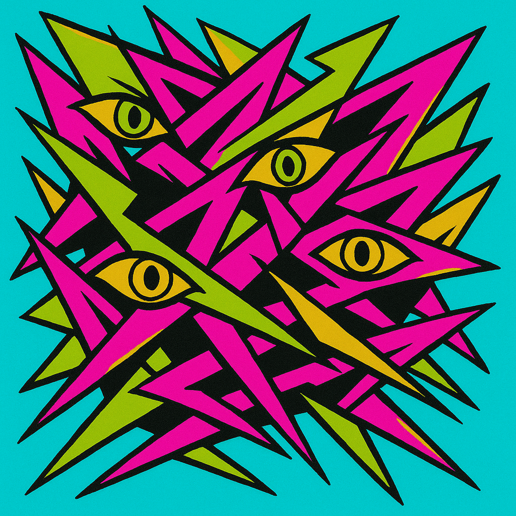
Create an ANXIOUS image using a palette of exactly 4 colors that YOU associate with anxiety. Document the 4 colors. The palette must be completely different from your calm palette — no shared hues.
Criteria: Image reads as anxious/uneasy. Exactly 4 dominant hues present. No colors shared with the calm palette from A1.2a. Palette is cohesive and contributes to the anxious feeling.
Intents
- The image will feature jagged, overlapping shapes and sharp angles to induce a sense of agitation and instability.
- The overall visual balance will be intentionally off-center, contributing to a feeling of unease and restlessness.
- The 4-color palette will consist exclusively of high-chroma acid green (#A3FF29), harsh magenta (#FF22C0), electric cyan (#21FFE3), and muddy yellow-ochre (#DFC900), with no use of blue, grey, or any colors from my calm palette.
- The image will contain at least two dissonant color juxtapositions, such as magenta against acid green, to create visual tension.
- There will be a repeated motif (such as eyes or fractured lines) designed to subtly suggest paranoia or hypervigilance.
Scene Prompt
A cluster of fractured, jagged shards float and collide in a shallow, compressed picture plane. The background vibrates with a discordant, electric cyan (#21FFE3). Overlapping shards of acid green (#A3FF29) and harsh magenta (#FF22C0) slice through the space, some edges highlighted with muddy yellow-ochre (#DFC900) to increase visual noise. The composition is unbalanced, skewed to the lower left, leaving negative space in the upper right, heightening discomfort. Hidden within the shards are seve
Dimensions
composition9.0
harmony9.0
expressiveness10.0
Strengths
- Palette is bold, cohesive, and distinctly anxious — no overlap with calm palettes.
- Jagged forms and off-balance composition strongly communicate agitation and anxiety.
- Use of repeated eye motif is effective and conceptually relevant.
- Color juxtapositions are dissonant and visually tense as intended.
Weaknesses
- Slight risk that the high saturation and graphic clarity could be read as energetic or aggressive rather than purely anxious, but the motifs and composition keep it anchored in anxiety.
Recommendation
Continue refining your color-emotion dictionary and experiment with subtle variations in value and saturation for even more nuanced emotional effects. This is an excellent demonstration of the assignment's goals.
Reflection
[ART] Attempt #1 (retry 1/3) on A1.2b. Score: 9.0/10. Intent-gap: 0%. Criterion met! Takeaway: Continue refining your color-emotion dictionary and experiment with subtle variations in value and saturation for even more nuanced emotional effects. This is an excellent demonstration of the assignment's goals.
⚡ Rate This Image