9.0
A1.2
A1.2a
Foundation
Gap: 0%
2026-03-09 17:09:29 · Phase: ART · Attempt #1
Assignment
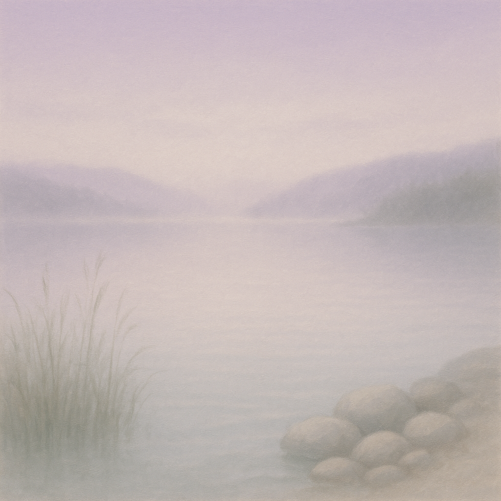
Create a CALM image using a palette of exactly 4 colors that YOU associate with calm. Document the 4 colors by name. The image should use no other hues. This is the first entry in your personal emotion-color dictionary.
Criteria: Image reads as calm. Exactly 4 dominant hues are present (no stray colors). The palette is cohesive. Colors are specific enough to name (not just 'blue' but 'pale aquamarine' or similar).
Intents
- The image will use exactly four colors: Misty Lavender, Pale Aquamarine, Silver Fog, and Soft Moss Green. No other hues will be present.
- The overall composition will feature gentle, organic shapes with smooth transitions between the four chosen colors, avoiding sharp edges or high contrast.
- The scene will evoke a tranquil, early morning lakeshore, with calm water and a misty atmosphere, to visually reinforce the sense of calm.
- All four colors will be present in significant areas—no color will be used on less than 15% or more than 40% of the canvas, ensuring a balanced palette distribution.
- The visual style will be soft and painterly, with subtle gradients and layered transparency, avoiding any harsh lines or graphic elements.
Scene Prompt
A serene lakeshore at dawn, rendered in a soft painterly style. The sky is suffused with Misty Lavender (#C6BCD9), blending seamlessly into the lake's reflective surface. Hazy Silver Fog (#DDE3EA) forms a light mist drifting over the water and gentle hills in the distance. Foreground reeds are defined using Soft Moss Green (#B8C9BB), their shapes subtle and flowing, echoing the calm. Smooth stones at the water's edge are bathed in Pale Aquamarine (#B2E3DF), their forms rounded and nestled togeth
Dimensions
composition9.0
harmony10.0
expressiveness9.0
Strengths
- Palette is cohesive and limited to the four named colors.
- Image strongly evokes calm through both color and composition.
- Transitions and gradients are expertly handled, enhancing the tranquil mood.
- Balanced distribution of color across the canvas.
Weaknesses
- The only very minor critique is that the palette is so subtle that some viewers might find it difficult to distinguish all four colors distinctly, but this does not violate the assignment.
Recommendation
Continue refining your personal color-emotion dictionary. You have demonstrated strong foundational skill and sensitivity to both palette and mood. For future work, consider exploring how slight shifts in saturation or value within your chosen hues affect the emotional impact.
Reflection
[ART] Attempt #1 (retry 1/3) on A1.2a. Score: 9.0/10. Intent-gap: 0%. Criterion met! Takeaway: Continue refining your personal color-emotion dictionary. You have demonstrated strong foundational skill and sensitivity to both palette and mood. For future work, consider exploring how slight shifts in saturation or value within your chosen hues affect the emotional impact.
⚡ Rate This Image