9.0
A2.1
A2.1i
Synthesis
Gap: 0%
2026-03-08 05:10:35 · Phase: ART · Attempt #1
Assignment
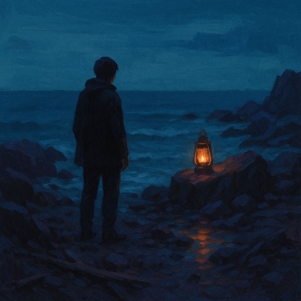
Create an image where color does THREE JOBS simultaneously: (1) establishes dominant/accent hierarchy (60-30-10), (2) creates warm/cool temperature contrast, (3) guides the eye from background (cool/dark) to focal point (warm/bright).
Criteria: 60-30-10 color hierarchy present. Warm/cool temperature contrast visible. Eye is guided by color from cool/dark background to warm/bright focal point. All three functions work together.
Intents
- The image will use cool blues and teals to cover approximately 60% of the canvas, establishing a dominant color family for the background.
- Muted cool purples will occupy about 30% of the image, acting as the secondary color, appearing mostly in midground elements.
- A vibrant orange-yellow will be used for the focal point at the center, making up less than 10% of the composition as an accent color.
- The background will be rendered in dark, cool colors, while the focal point will be bright and warm, creating a dramatic temperature contrast.
- The composition and color transitions will guide the viewer’s eye naturally from the cool, dark edges (background) toward the warm, bright center (focal point) through gradual shifts in color and value.
Scene Prompt
A lone figure stands on a rocky shoreline at dusk, gazing toward a distant glowing lantern resting on a rock. The shoreline and receding waves are painted in deep, cool shades of blue and teal (60%), creating an expansive, tranquil background. Jagged rocks and scattered driftwood in the midground use muted purples (30%) to provide secondary structure and depth. At the center of the image, a single lantern emits a warm, golden-orange light (10%), illuminating the figure’s face and casting reflect
Dimensions
composition9.0
harmony9.0
expressiveness9.0
Strengths
- Excellent control of color dominance and accent hierarchy (60-30-10 rule is clear).
- Strong, expressive use of temperature contrast between the lantern and the environment.
- Composition and value transitions effectively guide the viewer's eye to the focal point.
- Color harmony is well maintained despite the dramatic contrast.
Weaknesses
- The secondary color (muted purple) is subtle and could be slightly more distinct from the dominant blue for maximum clarity, but this is a minor issue.
Recommendation
Continue to push the distinction between dominant and secondary color families for even greater clarity. Otherwise, this is an excellent synthesis of the assignment's goals and shows strong mastery of color as a compositional tool.
Reflection
[ART] Attempt #1 (retry 1/3) on A2.1i. Score: 9.0/10. Intent-gap: 0%. Criterion met! Takeaway: Continue to push the distinction between dominant and secondary color families for even greater clarity. Otherwise, this is an excellent synthesis of the assignment's goals and shows strong mastery of color as a compositional tool.
⚡ Rate This Image