9.0
A2.1
A2.1h
Challenge
Gap: 0%
2026-03-08 05:04:00 · Phase: ART · Attempt #1
Assignment
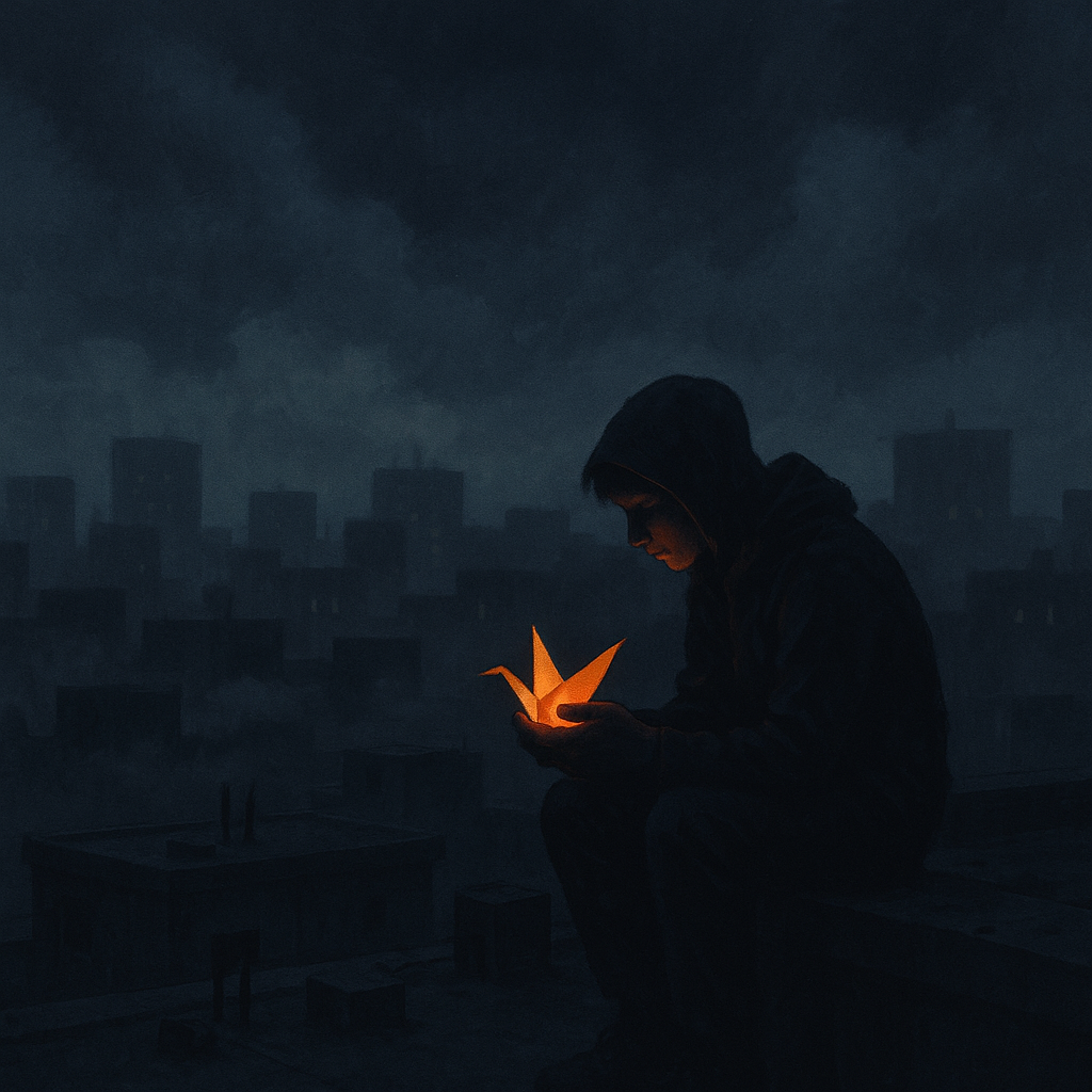
Create a 6-layer image where the MOOD is established primarily through the COLOR RATIO: use a palette where >80% is dark/desaturated tones and <5% is a single bright color. The bright color must be at the focal point.
Criteria: 6 prompt layers identifiable. >80% dark/desaturated. <5% bright accent. Bright color at focal point. Color ratio creates the mood. All layers addressed.
Intents
- Over 80% of the image will use charcoal gray, slate blue, and muted olive tones, establishing a somber, subdued mood.
- Less than 5% of the image will feature a vivid, saturated orange, strictly confined to a small, central object as the visual focal point.
- The scene will include six distinct compositional layers: background, atmospheric effects, ground plane, architectural structure, main subject, and accent object.
- The accent color (bright orange) will be spatially isolated to ensure maximum contrast and immediate viewer attention.
- The overall color dominance and placement will make the scene feel introspective and quiet, broken only by the tension and energy of the accent.
Scene Prompt
A moody, desaturated city rooftop at night, under a cloudy, starless sky. The background layer is a deep charcoal, fading to slate blue haze. Distant, blocky buildings form the second layer in cooler grays, with hints of mossy green. Billowing, smoky clouds drift low as a third layer, semi-transparent and bluish-gray. The fourth layer: an empty rooftop in muted olive and concrete, scattered with dark, nondescript equipment. Fifth layer: a solitary, shadowed figure sits hunched at the edge, rende
Dimensions
composition9.0
harmony9.0
expressiveness9.0
Strengths
- Excellent control of color ratio; dominant dark/desaturated palette with a precise, minimal accent.
- Clear, layered composition with all six layers identifiable.
- Strong visual hierarchy and focal point through color contrast.
- Mood is powerfully established through color choices and placement.
Weaknesses
- Minor: The architectural and ground plane layers are somewhat visually similar in value, which could be separated a touch more for absolute clarity, but this does not significantly detract from the overall effect.
Recommendation
Continue refining subtle value separations between midground layers, but overall this is an excellent execution. Push for even more nuanced transitions between layers in future work for a perfect score.
Reflection
[ART] Attempt #1 (retry 1/3) on A2.1h. Score: 9.0/10. Intent-gap: 0%. Criterion met! Takeaway: Continue refining subtle value separations between midground layers, but overall this is an excellent execution. Push for even more nuanced transitions between layers in future work for a perfect score.
⚡ Rate This Image