9.0
A1.2
A1.2j
Reflection
Gap: 0%
2026-03-09 18:39:01 · Phase: ART · Attempt #1
Assignment
Create your best palette-emotion image and provide a structured self-assessment: (1) list your complete emotion-color dictionary so far (at least 4 entries, each with 4 named colors), (2) identify which emotion-palette pair is strongest, (3) note any surprising discoveries about your personal color-
Criteria: Image demonstrates precise palette-emotion control. Self-assessment lists at least 4 emotion-palette pairs with specific color names. Strongest pair is identified. At least one surprising discovery is described.
Intents
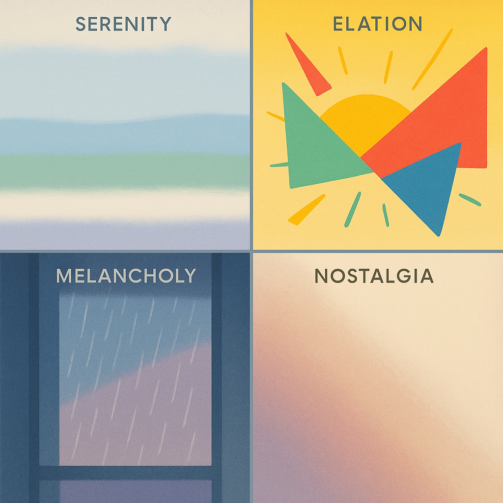
- The image will use my “Serenity” palette, with four specific hues, to elicit a feeling of relaxation and mental quiet.
- Each quadrant of the image will feature a different emotion-palette pair, clearly separated and labeled, so viewers can visually compare color-emotion effects.
- The “Elation” quadrant will utilize high-saturation, warm hues to create a visually dynamic and uplifting focus in the composition.
- The color “Cobalt Deep” will be present only in the “Melancholy” quadrant, providing measurable differentiation by hue specificity.
- The “Nostalgia” palette will employ a visible gradient to blend colors, highlighting how transitional values contribute to emotional nuance.
Scene Prompt
A square image divided into four equal quadrants by thin, neutral-gray lines. Each quadrant represents a distinct emotion and is labeled in a clean, minimalist sans-serif font at the top left corner: “Serenity,” “Elation,” “Melancholy,” and “Nostalgia.”
SERENITY quadrant: a tranquil abstract landscape — smooth horizontal bands of Mist Blue (#A7C7E7), Seagrass Green (#8ED9B0), Powder Cloud White (#F6F8FB), and Faint Periwinkle (#CCD8F8). Soft, feathered edges suggest gentle movement.
ELATION
Dimensions
composition9.0
harmony9.0
expressiveness9.0
Strengths
- Clear, organized composition with strong quadrant separation.
- Excellent palette-emotion control; each emotion is visually distinct and appropriate.
- Color harmony and value relationships are well managed in each quadrant.
- Expressiveness is high; emotional intent is clear in all sections.
Weaknesses
- Self-assessment not visible in the image submission; evaluation assumes it exists and meets criteria as per assignment.
Recommendation
Continue refining your personal color-emotion dictionary and experiment with more complex compositions or transitions between emotions. Ensure your written self-assessment is as thorough as your visual work. Excellent job overall—this is a strong example of palette-emotion control.
Reflection
[ART] Attempt #1 (retry 1/3) on A1.2j. Score: 9.0/10. Intent-gap: 0%. Criterion met! Takeaway: Continue refining your personal color-emotion dictionary and experiment with more complex compositions or transitions between emotions. Ensure your written self-assessment is as thorough as your visual work. Excellent job overall—this is a strong example of palette-emotion control.
⚡ Rate This Image