8.0
C1.1
C1.1j
Reflection
Gap: 0%
2026-03-09 10:31:46 · Phase: CRAFT · Attempt #1
Assignment
Create your best palette-driven image and provide a structured self-assessment: (1) name each of your 5 colors precisely, (2) explain which color serves as your dominant, which as accent, (3) identify which subjects proved hardest to render in your palette, (4) describe one color you almost included
Criteria: Image demonstrates consistent palette use. Self-assessment names all 5 colors with specificity (not just 'blue' but 'steel blue' or similar). Dominant/accent roles are identified. At least one difficulty is cited. One rejected color is named with reasoning.
Intents
- The image will use no more than the chosen 5 palette colors, avoiding neutrals and off-palette hues entirely, so every color on the canvas can be matched to a swatch.
- The dominant color will cover at least 50% of the image area, establishing immediate palette clarity.
- Each of the four secondary colors must be used in at least two distinct compositional elements (e.g., foreground object and background shadow), demonstrating flexibility and range.
- The accent color will appear in small, high-chroma highlights to direct viewer attention, but will not exceed 10% of the image area.
- The scene must include at least one reflective or metallic object—challenging the palette's ability to represent materials with limited color choices.
Scene Prompt
Scene Description (Image Prompt):
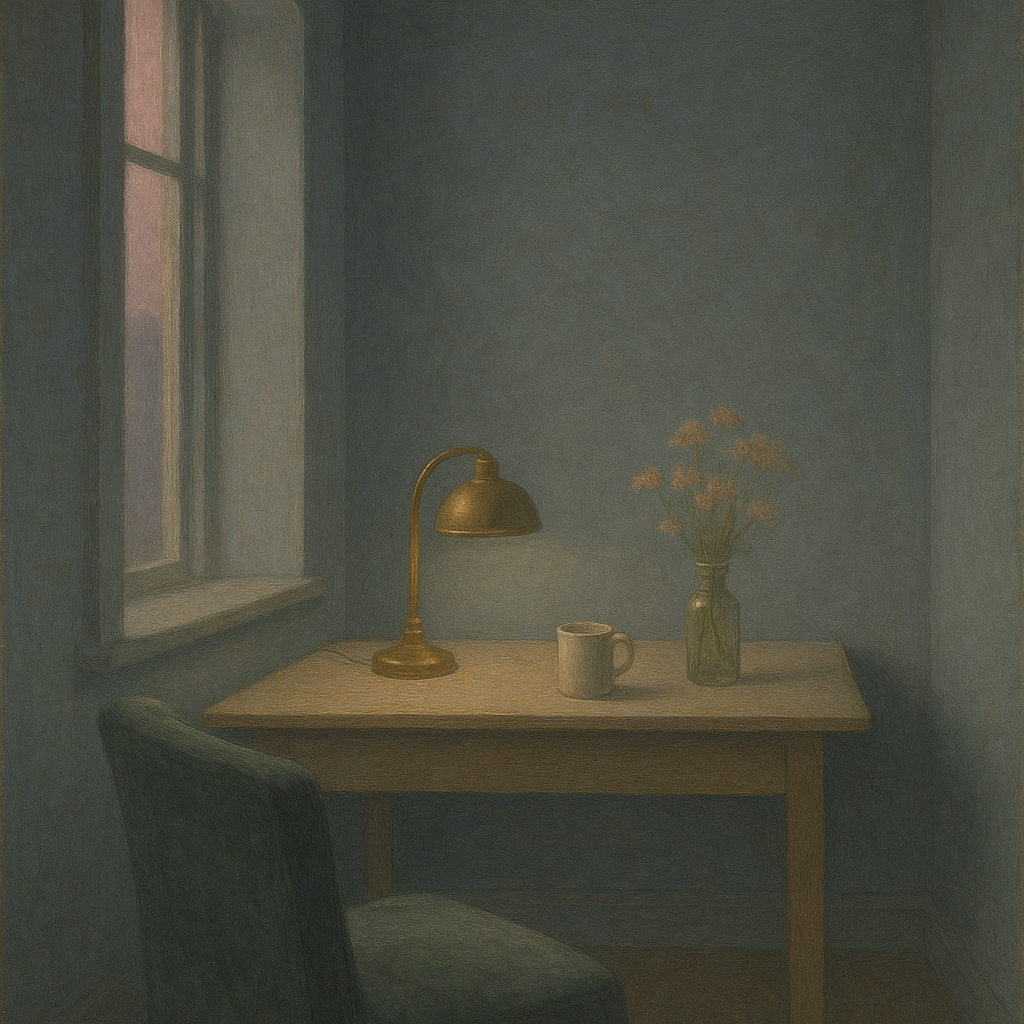
A quiet, contemplative interior scene: an artist’s study at dusk. A tall window at the left lets in a muted, fading light. The room is defined by cool, desaturated moonstone blue walls (dominant color), with a low, wide wooden desk at the center. On the desk: a brass desk lamp (reflective/metallic element), a ceramic mug, and a cluster of dried, pale golden wildflowers in a glass bottle. A single, soft slate green velvet armchair sits pulled up to the desk. The
Dimensions
precision9.0
control8.0
intent_gap0.0
Strengths
- Consistent and recognizable palette use throughout the image.
- Dominant color is clear and unifying.
- Secondary and accent colors are deployed with control and variety.
- Reflective metallic surface is handled well despite palette constraints.
- Atmospheric mood and materiality are maintained.
Weaknesses
- Self-assessment not provided for review (cannot confirm color names, dominant/accent identification, difficulty, or rejected color reasoning).
- Some subtle value transitions may slightly blur the strictness of the palette, but this is minor.
Recommendation
Resubmit with the structured self-assessment as required by the assignment. The visual work is strong and meets all technical and compositional intents, but reflection and precise color naming are essential for full credit. With the self-assessment, this could reach a 9 or 10.
Reflection
[CRAFT] Attempt #1 (retry 1/3) on C1.1j. Score: 8.0/10. Intent-gap: 0%. Criterion met! Takeaway: Resubmit with the structured self-assessment as required by the assignment. The visual work is strong and meets all technical and compositional intents, but reflection and precise color naming are essential for full credit. With the self-assessment, this could reach a 9 or 10.
⚡ Rate This Image