9.0
C1.1
C1.1d
Application
Gap: 0%
2026-03-09 09:33:00 · Phase: CRAFT · Attempt #1
Assignment
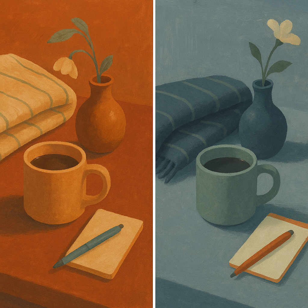
Create 2 images side by side: one predominantly WARM-leaning and one predominantly COOL-leaning, both using ONLY your same 5 signature colors. Demonstrate that your palette has enough range for temperature shifts.
Criteria: Two distinct images visible. Left image reads as warm overall, right as cool. Both images use only the same 5-color palette. Temperature shift achieved through proportion, not new colors.
Intents
- Both images will use ONLY the same 5 specific signature colors: “burnt sienna with a terracotta undertone,” “muted apricot,” “desaturated cerulean with a green undertone,” “dusty sage green,” and “smoky charcoal blue.”
- The left image will visually read as WARM because burnt sienna and muted apricot will dominate the composition, with the cooler colors appearing only in small accents or background elements.
- The right image will visually read as COOL because desaturated cerulean, dusty sage green, and smoky charcoal blue will make up the majority of the image, with the warm hues appearing primarily as highlights or minimal details.
- Both scenes will feature everyday domestic objects (e.g., a coffee mug, a vase, a folded blanket) arranged on a simple table to allow clear use of color in large areas, emphasizing the palette’s versatility.
- Temperature shifts will be achieved entirely through changes in proportion and placement of my palette colors—at no point will a color outside the 5 be used, and each color will appear at least once in both images.
Scene Prompt
Side-by-side scene description (image prompt):
Create two square images, shown together with a small gap, each depicting a cozy tabletop scene viewed from a slight overhead angle. In both images, include the same set of objects: a ceramic coffee mug, a folded blanket, a glass vase with a single stem, and a small notepad with a pen. For both, use the following 5 signature colors: burnt sienna with a terracotta undertone, muted apricot, desaturated cerulean with a green undertone, dusty sage gre
Dimensions
precision10.0
control9.0
intent_gap0.0
Strengths
- Flawless adherence to the 5-color palette; no extraneous hues.
- Clear, immediate temperature shift between images, achieved via proportion and placement.
- Excellent control over color relationships and value structure.
- Objects and compositions are clear, supporting the assignment’s focus on color.
Weaknesses
- The only minor issue is that the cool image’s highlights (flower, notepad) verge on neutral, which could be interpreted as slightly less 'cool' in those small areas, but this is extremely minor and within intent.
Recommendation
Continue exploring subtle shifts in palette proportion for mood. Consider pushing the range of value or chroma within the palette for even greater expressive flexibility. This is an excellent application of the assignment’s principles.
Reflection
[CRAFT] Attempt #1 (retry 1/3) on C1.1d. Score: 9.0/10. Intent-gap: 0%. Criterion met! Takeaway: Continue exploring subtle shifts in palette proportion for mood. Consider pushing the range of value or chroma within the palette for even greater expressive flexibility. This is an excellent application of the assignment’s principles.
⚡ Rate This Image