8.0
C1.1
C1.1b
Foundation
Gap: 0%
2026-03-09 09:03:46 · Phase: CRAFT · Attempt #1
Assignment
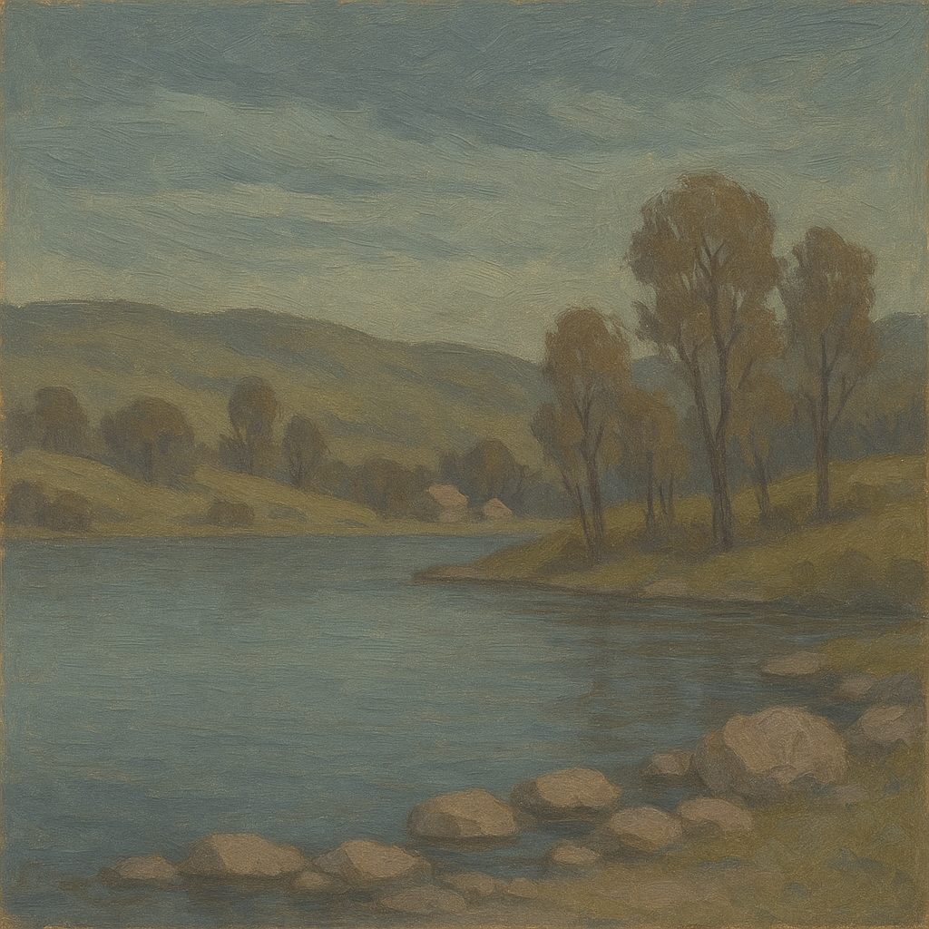
Create a landscape using ONLY your 5 signature colors (plus black and white for value). No hue outside your declared palette should appear anywhere in the image.
Criteria: Image is a recognizable landscape. All hues match the 5 declared palette colors. No stray hues outside the palette. Black and white used only for value adjustment.
Intents
- The sky in the image will be rendered in desaturated cerulean with a green undertone, covering at least 30% of the composition.
- The main landmass will be depicted in muted olive with a yellow-gray bias, used for hills and foreground vegetation.
- Water elements (lake or river) will feature soft slate blue, slightly cool and desaturated, occupying at least 15% of the scene.
- Tree trunks and architectural accents will be painted using a warm brown-gray, with visible brushwork for added texture.
- Key highlights on rocks and distant buildings will use pale rose quartz (a dusty, low-chroma pink) for atmospheric accents and to tie the palette together.
Scene Prompt
A serene lakeside landscape at dusk, rendered in a painterly, semi-impressionistic style. The sky, which occupies the upper third, is a desaturated cerulean with a green undertone, streaked with wispy clouds. Rolling hills in muted olive (yellow-gray bias) dominate the middle ground, interspersed with clusters of trees whose trunks and branches are warm brown-gray. The lake in the foreground mirrors the sky’s soft slate blue, edged with stones highlighted by pale rose quartz. One or two distant
Dimensions
precision9.0
control8.0
intent_gap0.0
Strengths
- All five signature colors are clearly present and consistently applied.
- No stray hues outside the palette are visible.
- Landscape is easily recognizable and compositionally sound.
- Good control of value using black and white for adjustment only.
Weaknesses
- Palette use is slightly conservative; the pale rose quartz is subtle and could be more assertive for greater visual impact.
- Minor blending in some areas makes it slightly hard to distinguish between the muted olive and brown-gray in shadowed regions, but this does not introduce off-palette hues.
Recommendation
Continue exploring bolder applications of accent colors (like pale rose quartz) to enhance focal points. Maintain discipline with palette restrictions, as demonstrated here. This is a strong foundational exercise—ready to move on to more complex compositions or mood variations within the same palett
Reflection
[CRAFT] Attempt #1 (retry 1/3) on C1.1b. Score: 8.0/10. Intent-gap: 0%. Criterion met! Takeaway: Continue exploring bolder applications of accent colors (like pale rose quartz) to enhance focal points. Maintain discipline with palette restrictions, as demonstrated here. This is a strong foundational exercise—ready to move on to more complex compositions or mood variations within the same palette.
⚡ Rate This Image