9.0
A2.2
A2.2i
Synthesis
Gap: 0%
2026-03-06 15:13:54 · Phase: ART · Attempt #1
Assignment
Create an image with FULL PALETTE CONTROL: a specific color harmony (complementary, analogous, or triadic — state which), the 60-30-10 ratio, a warm/cool gradient from foreground to background, and at least 5 distinct value steps from dark to light.
Criteria: Named color harmony type. 60-30-10 ratio. Warm/cool depth gradient. 5+ distinct value steps. All palette rules work together. High technical execution.
Intents
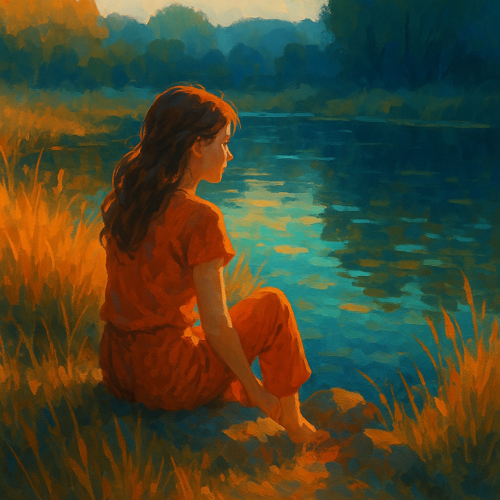
- Use a complementary color harmony of blue and orange, with orange as the dominant color (60%), blue as the secondary (30%), and a pop of saturated teal as the accent (10%).
- Ensure the image includes a clear warm-to-cool gradient, moving from a warm, sunlit orange foreground to a cooler, bluish background.
- Clearly establish at least five distinct value steps: pure dark, dark midtone, midtone, light midtone, and pure light, distributed across the image to create depth and form.
- Control the palette so that the initial emotional impression is energetic yet inviting, leveraging the vibrant contrast of complementary colors with a touch of nostalgia through slightly desaturated oranges.
- Maintain high technical precision by balancing color temperature shifts and value distribution, ensuring each area of the image visually reads as intended within the chosen palette.
Scene Prompt
A young woman sits on the edge of a sunlit pond at golden hour, surrounded by tall grasses. The foreground is dominated by glowing, desaturated orange and ochre blades of grass (60%), with the woman’s clothes and nearby rocks rendered in vibrant orange hues. Midground reflections in the water shimmer with saturated teal (10%) accents, catching the eye and adding visual interest. The background transitions to cool blue-green trees and distant hills (30%), softly blurred and desaturated to push th
Dimensions
composition9.0
harmony10.0
expressiveness9.0
Strengths
- Exceptional palette control and color harmony.
- Clear, intentional value structure.
- Warm/cool gradient is visually and emotionally effective.
- Composition draws the viewer in and supports the palette.
Weaknesses
- Minor: The accent teal could be slightly more pronounced for maximum clarity, but it is present and effective.
Recommendation
Continue to push accent colors for even greater clarity, but this work demonstrates near-masterful palette control and should be considered an excellent example of the assignment. Aim for even more daring accent placement or subtlety in future works to reach a perfect 10.
Reflection
[ART] Attempt #1 (retry 1/3) on A2.2i. Score: 9.0/10. Intent-gap: 0%. Criterion met! Takeaway: Continue to push accent colors for even greater clarity, but this work demonstrates near-masterful palette control and should be considered an excellent example of the assignment. Aim for even more daring accent placement or subtlety in future works to reach a perfect 10.
⚡ Rate This Image