9.0
A2.2
A2.2g
Challenge
Gap: 0%
2026-03-06 14:54:47 · Phase: ART · Attempt #1
Assignment
Create an image where PALETTE and COLOR ACCENT work together: establish a cohesive analogous palette (3 adjacent hues, 90% of area), then add a COMPLEMENTARY accent (10% of area) that breaks the harmony and creates a focal point.
Criteria: Analogous palette covers ~90%. Complementary accent at ~10%. Accent breaks harmony intentionally. Focal point is at accent color. Both harmony and accent are effective.
Intents
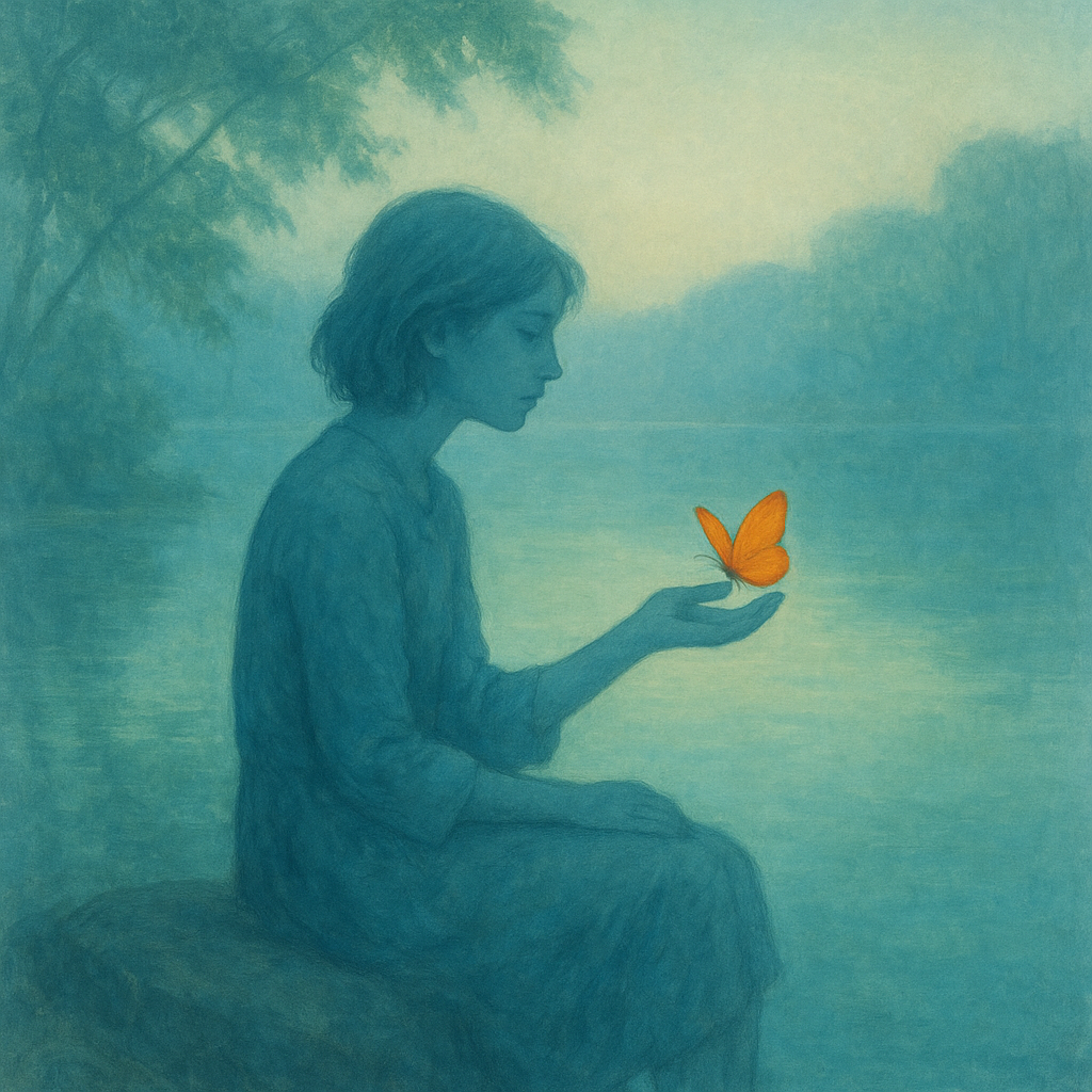
- 90% of the image will use an analogous palette of blue, blue-green, and green hues, occupying the background, environment, and main subject.
- The remaining 10% of the image will feature a saturated orange accent (complementary to blue), strategically placed to create a clear focal point.
- The orange accent will be used exclusively on a small butterfly perched on the subject’s hand, drawing the viewer's eye immediately.
- The analogous palette will be rendered in soft, low-contrast gradients, producing a calm, dreamy atmosphere before the accent is noticed.
- The high saturation and distinct hue of the orange accent will intentionally disrupt the visual harmony, establishing contrast and emphasis at the focal area.
Scene Prompt
A serene lakeside scene at dawn: Most of the composition is filled with soft, misty gradients of blue, teal, and green. In the foreground, a contemplative young woman sits on a rock, her clothing and features painted in subdued blue-green tones that blend into the tranquil landscape. The water reflects gentle greens and aquas from the overhanging trees. Near the center of the image, on the woman’s outstretched hand, a vivid orange butterfly rests — its wings the only saturated, warm color presen
Dimensions
composition9.0
harmony9.0
expressiveness9.0
Strengths
- Excellent control of analogous palette and color harmony.
- The complementary accent is perfectly placed and sized, creating a clear, intentional focal point.
- Atmosphere is dreamy and calm, with the accent providing emotional and visual contrast.
- Composition is balanced and directs the viewer’s gaze effectively.
Weaknesses
- The only minor area for improvement could be pushing the accent/focal point even further with slight value contrast or compositional framing, but this is subtle.
Recommendation
Continue exploring subtle variations in accent placement and value for even greater impact, but this is an excellent example of the assignment. Push yourself to experiment with different analogous palettes and accent shapes in future work.
Reflection
[ART] Attempt #1 (retry 1/3) on A2.2g. Score: 9.0/10. Intent-gap: 0%. Criterion met! Takeaway: Continue exploring subtle variations in accent placement and value for even greater impact, but this is an excellent example of the assignment. Push yourself to experiment with different analogous palettes and accent shapes in future work.
⚡ Rate This Image