9.0
A2.2
A2.2f
Application
Gap: 0%
2026-03-08 05:56:29 · Phase: ART · Attempt #1
Assignment
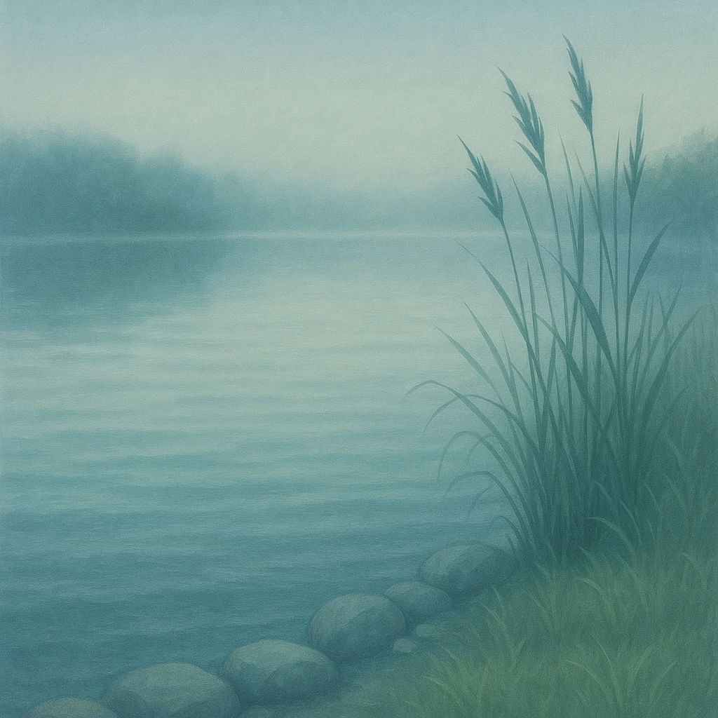
Create an image with ANALOGOUS HARMONY: choose 3 adjacent colors on the color wheel (e.g., yellow-green, green, blue-green) and use ONLY those 3 hue families. No complementary or contrasting hues.
Criteria: Three adjacent hues present. No hues from opposite side of color wheel. Colors are harmonious/related. Palette feels cohesive. 3 hues are distinctly identifiable.
Intents
- The image will exclusively use colors from the blue, blue-green, and green hue families, with no inclusion of warm or complementary hues.
- Each of the three chosen hues will appear in large, clearly defined areas so that they are easily distinguishable on first viewing.
- The overall palette will create a serene, cohesive atmosphere by maintaining low to medium saturation and soft transitions between hues.
- All smaller elements, shadows, and highlights will be achieved using tints and shades of the three chosen hues only, without introducing other color families.
- The palette will feel balanced, with no single hue dominating more than 50% of the composition, ensuring harmonic visual unity.
Scene Prompt
A peaceful lakeside scene at dawn: Smooth water reflects the misty sky, with soft ripples capturing transitions between blue, blue-green, and green hues. Tall reeds and gentle grasses on the shore are rendered in naturalistic greens and blue-greens, bending slightly with the morning breeze. The sky is muted blue with hints of blue-green near the horizon, seamlessly blending into the water below. Large, rounded stones line the water’s edge, shaded with subtle blue and green-grays. The style is se
Dimensions
composition9.0
harmony10.0
expressiveness9.0
Strengths
- Excellent control of analogous palette; no stray hues.
- Clear, harmonious color relationships.
- Serene, cohesive atmosphere achieved through soft transitions and low saturation.
- Balanced composition with strong visual unity.
Weaknesses
- Blue is slightly more dominant, but not enough to disrupt harmony or intent.
Recommendation
Continue exploring subtle variations within analogous palettes. For further challenge, experiment with slightly higher contrast or more complex forms while maintaining harmony. Excellent work.
Reflection
[ART] Attempt #1 (retry 1/3) on A2.2f. Score: 9.0/10. Intent-gap: 0%. Criterion met! Takeaway: Continue exploring subtle variations within analogous palettes. For further challenge, experiment with slightly higher contrast or more complex forms while maintaining harmony. Excellent work.
⚡ Rate This Image