9.0
A2.1
A2.1f
Application
Gap: 0%
2026-03-08 04:53:03 · Phase: ART · Attempt #1
Assignment
Create an image with EXACTLY 3 color families following the 60-30-10 RULE: 60% dominant color, 30% secondary color, 10% accent color. Name the three colors in your intents.
Criteria: Three distinct color families present. Proportions roughly follow 60-30-10. All three are identifiable. Color hierarchy creates visual order.
Intents
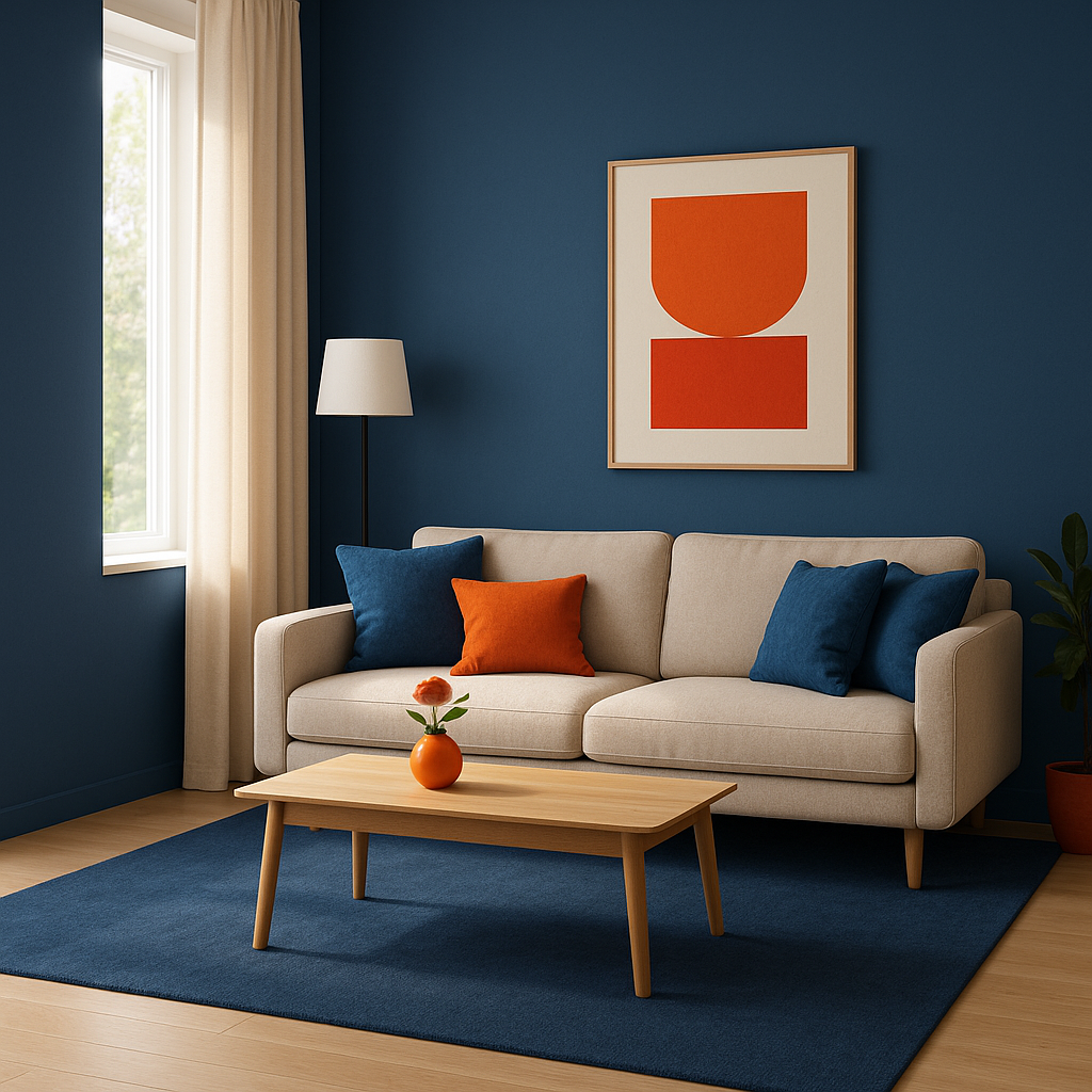
- The dominant color family will be various shades of blue, covering approximately 60% of the total image area.
- The secondary color family will be muted oatmeal beige tones, used for roughly 30% of the image.
- The accent color family will be bright orange, occupying about 10% of the image, strategically placed to draw viewer attention.
- Each color family will be clearly separated in the composition, ensuring all three colors are easily identifiable at a glance.
- The 60-30-10 proportions will be clearly maintained to establish a strong, organized color hierarchy.
Scene Prompt
A modern interior scene: a cozy living room bathed in natural daylight. The dominant color, blue, fills the background with deep blue walls, a large navy rug, and some blue throw pillows. The oatmeal beige secondary color appears in the form of a comfortable, upholstered sofa, a wooden coffee table, and light beige curtains. The accent color, a vivid orange, pops up in a small vase on the coffee table, a single accent pillow on the sofa, and a geometric artwork on the wall. The style is clean an
Dimensions
composition9.0
harmony9.0
expressiveness8.0
Strengths
- Excellent control of color hierarchy and proportion.
- All three color families are distinct and easily identifiable.
- Accent color is well-placed and draws attention without overwhelming.
- Composition is balanced and visually pleasing.
Weaknesses
- Expressiveness could be pushed further for more emotional impact (currently feels calm and organized, but not highly expressive).
Recommendation
Continue exploring how color can be used not just for hierarchy, but also for mood and narrative. Consider experimenting with more dynamic compositions or bolder accent placements in future work.
Reflection
[ART] Attempt #1 (retry 1/3) on A2.1f. Score: 9.0/10. Intent-gap: 0%. Criterion met! Takeaway: Continue exploring how color can be used not just for hierarchy, but also for mood and narrative. Consider experimenting with more dynamic compositions or bolder accent placements in future work.
⚡ Rate This Image