9.0
A2.1
A2.1d
Application
Gap: 0%
2026-03-08 04:38:37 · Phase: ART · Attempt #1
Assignment
Create an image using COMPLEMENTARY COLORS: one pair of opposites (red/green, blue/orange, or yellow/purple) with one as dominant (>60%) and the other as accent (<20%). The remaining area should be neutral.
Criteria: One complementary pair used. Dominant color >60%. Complement <20%. Neutrals fill the remainder. Complementary vibration is visible.
Intents
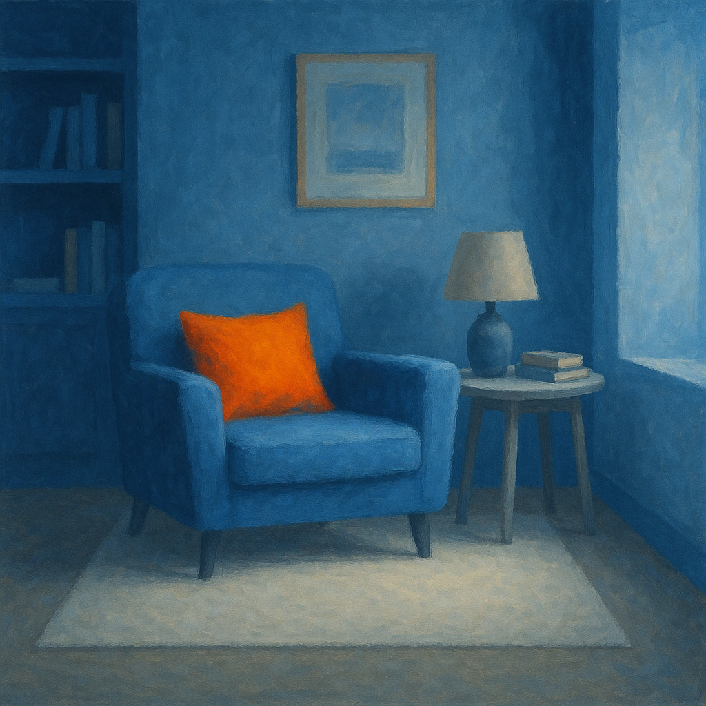
- The image will use blue as the dominant color, covering at least 60% of the total visual area.
- Orange will serve as the accent color, making up less than 20% of the image, and used to create a noticeable focal point.
- The remaining area (up to 20%) will consist of neutral colors—shades of gray and white—providing visual balance.
- There will be visible complementary vibration where blue and orange meet, enhancing the contrast and making the accent pop.
- The composition will create a clear visual hierarchy, with the viewer’s attention drawn immediately to the orange accent because of its placement and contrast.
Scene Prompt
A serene interior scene of a modern reading nook, depicted in painterly digital art. The majority (over 60%) of the room—walls, floor, and a cozy armchair—are rendered in varied shades of blue, from deep navy to soft sky. A small, vibrant orange throw pillow (<20% of the image area) sits on the blue armchair, acting as the focal point. The rest of the space features a simple white rug and a gray side table, together filling the remaining area with neutral tones. Where the bright orange pillow to
Dimensions
composition9.0
harmony9.0
expressiveness8.0
Strengths
- Excellent control of color dominance and accent.
- Strong complementary vibration between blue and orange.
- Clear visual hierarchy and focal point.
- Neutrals are used effectively to balance the palette.
Weaknesses
- A slightly more dynamic composition or subtle textural contrast could push expressiveness further.
Recommendation
Continue exploring ways to add nuance or emotional depth, but this is an excellent application of the assignment’s requirements. Well done.
Reflection
[ART] Attempt #1 (retry 1/3) on A2.1d. Score: 9.0/10. Intent-gap: 0%. Criterion met! Takeaway: Continue exploring ways to add nuance or emotional depth, but this is an excellent application of the assignment’s requirements. Well done.
⚡ Rate This Image