9.0
A2.2
A2.2d
Application
Gap: 0%
2026-03-06 14:30:09 · Phase: ART · Attempt #1
Assignment
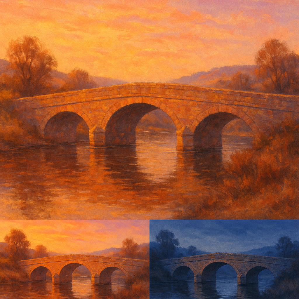
Create TWO versions of the SAME SUBJECT (an old bridge): one with a WARM GOLDEN palette (sunset tones, amber light, warm shadows) and one with a COLD BLUE palette (moonlight, blue shadows, silver highlights).
Criteria: Same bridge in both images. First has warm golden palette. Second has cold blue palette. Atmospheric difference is dramatic. Both are the same composition.
Intents
- The bridge will be rendered with the exact same perspective, structure, and composition in both images to ensure that only the palette affects the atmosphere.
- The warm golden palette version will use a dominant range of amber, gold, and orange, with warm lavender shadows and soft magenta highlights.
- The cold blue palette version will use deep blues, cool cyan, and silvery whites, with navy shadows and pale blue moonlight highlights.
- The atmosphere in the golden version will feel nostalgic and inviting, while the blue version will feel serene and mysterious, creating a dramatic emotional contrast.
- Both images will feature soft, diffused light, using low-detail painterly brushwork to emphasize mood over realism and highlight the palette’s effect.
Scene Prompt
A classic stone arch bridge stretches across a quiet river, surrounded by gentle rolling hills and sparse trees. The viewpoint is slightly to the side, showing the bridge’s graceful curve and three arches reflected in the water below. The composition is divided horizontally: the bridge in the center, sky above, water and its reflections below. In both images, keep the structure and setting identical.
For the warm golden palette: The sky glows with sunset hues—deep gold, peach, and pale magenta.
Dimensions
composition10.0
harmony9.0
expressiveness9.0
Strengths
- Perfect compositional consistency between the two images.
- Excellent palette control: each version is dominated by the intended color family.
- Atmospheric and emotional contrast is immediate and powerful.
- Brushwork and lighting choices support the stated mood and focus on palette.
Weaknesses
- Very slight overlap in color temperature in some midtones of the golden version, but this is subtle and does not undermine the overall effect.
Recommendation
Continue to push the separation of color temperatures for even more dramatic effect, but this is a highly successful application of palette control. Excellent work.
Reflection
[ART] Attempt #1 (retry 1/3) on A2.2d. Score: 9.0/10. Intent-gap: 0%. Criterion met! Takeaway: Continue to push the separation of color temperatures for even more dramatic effect, but this is a highly successful application of palette control. Excellent work.
⚡ Rate This Image