9.0
A2.1
A2.1i
Synthesis
Gap: 0%
2026-03-06 13:34:56 · Phase: ART · Attempt #1
Assignment
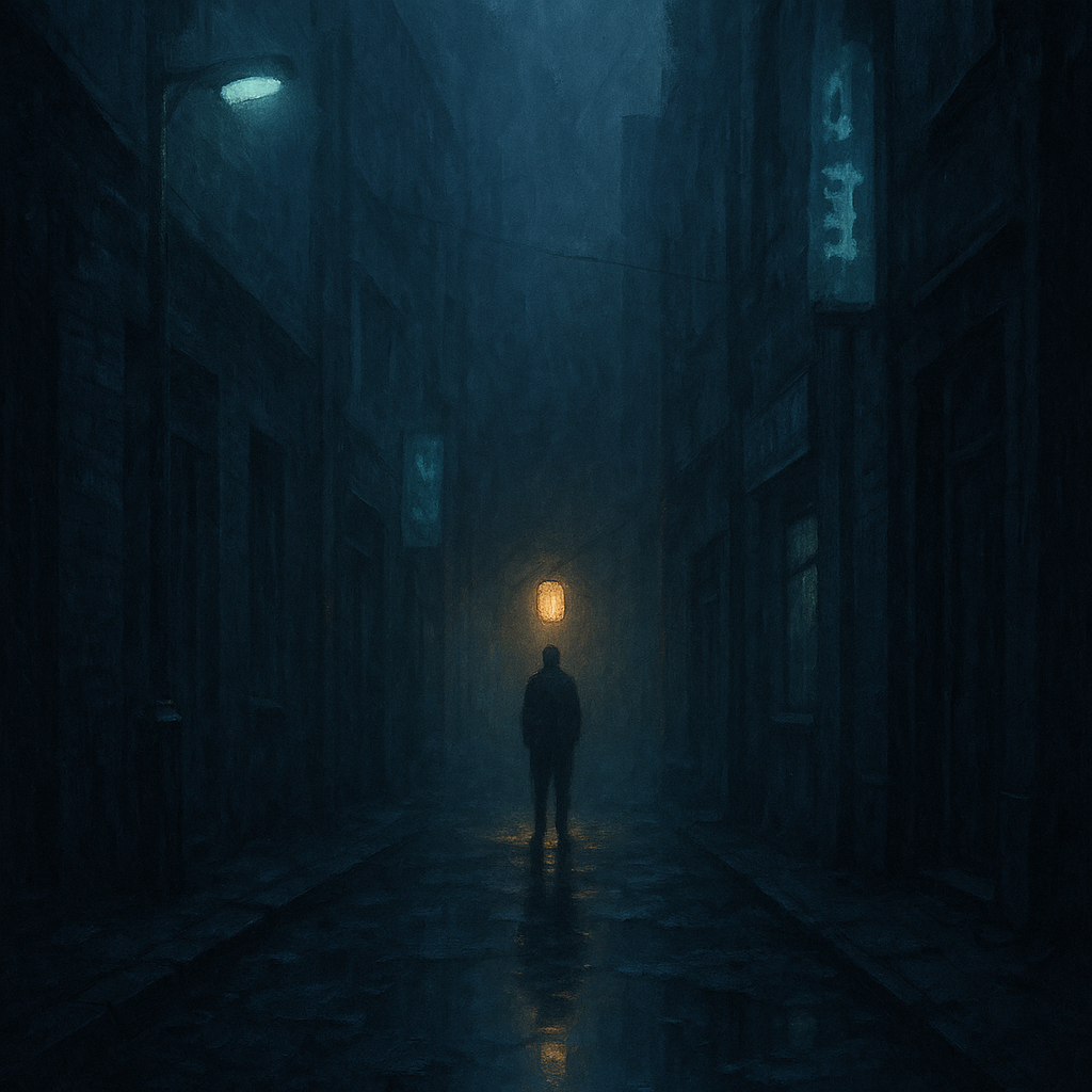
Create an image where color does THREE JOBS simultaneously: (1) establishes dominant/accent hierarchy (60-30-10), (2) creates warm/cool temperature contrast, (3) guides the eye from background (cool/dark) to focal point (warm/bright).
Criteria: 60-30-10 color hierarchy present. Warm/cool temperature contrast visible. Eye is guided by color from cool/dark background to warm/bright focal point. All three functions work together.
Intents
- Over 60% of the image will be dominated by cool, dark blue hues, establishing a clear color dominance according to the 60-30-10 rule.
- The secondary color (about 30%) will be a cooler teal that outlines the midground elements, creating soft contrast with the dominant blue while maintaining a cold temperature.
- Less than 10% of the composition will feature a saturated, warm golden-yellow accent that sharply contrasts with the cool surroundings, drawing immediate attention.
- The color temperature will transition from cool (background and midground) to a concentrated warm area (accent/focal point), making temperature contrast visually obvious.
- The viewer’s eye will be guided from the dark, cool periphery toward the warm, bright accent by deliberate placement of color/value steps, establishing a clear visual path.
Scene Prompt
A lone figure stands at the far end of a misty, nighttime urban alley. The background and most of the ground are painted in deep, cool blue tones (60%), evoking a cold, quiet atmosphere. Faded teal streetlights and neon signs (30%) softly illuminate the walls and puddles, adding a cool midtone glow that helps separate the alley’s depth layers. At the alley’s vanishing point, the figure is backlit by a single, glowing, golden-yellow lantern (<10%), which spills its warm light onto just the figure
Dimensions
composition9.0
harmony9.0
expressiveness9.0
Strengths
- Excellent use of color dominance and accent, strictly adhering to the 60-30-10 rule.
- Strong, clear warm/cool temperature contrast.
- Effective compositional guidance of the viewer’s eye using color and value.
- Atmospheric and emotionally evocative.
Weaknesses
- The secondary teal could be slightly more pronounced for even clearer separation, but this is a minor point.
Recommendation
Continue exploring subtle variations in secondary color to push hierarchy even further. This is an excellent synthesis of the assignment’s requirements and shows genuine mastery of the target skill.
Reflection
[ART] Attempt #1 (retry 1/3) on A2.1i. Score: 9.0/10. Intent-gap: 0%. Criterion met! Takeaway: Continue exploring subtle variations in secondary color to push hierarchy even further. This is an excellent synthesis of the assignment’s requirements and shows genuine mastery of the target skill.
⚡ Rate This Image